


Color has a direct impact on our mood, emotions, and wellbeing. The theory of color psychology speaks about the way in which color can affect our emotions and perceptions in a subconscious level and so, it is important to consider it when decorating our home.
If you have felt relaxed and comfortable within a space or on the contrary, angry and tense while in another one, this could be the influence of the predominant hue in the place. Color is a universal language and can be used as a tool to have an emotionally healthier house.
The first thing you should do in order to put color theory in practice at home is to define the main purpose each room will serve. Then, choose the predominant hue to support such activity and then the secondary ones, avoid having more than three or four colors per room, since this would make it seem messy.
What do colors mean?
There are three kinds of color: the ones that invite to action, the ones that have a calming effect, and the neutral ones. Even though they all have specific effects, generally speaking, light colors provide a sense of greater space and light, while the dark ones involve sophistication, warmth, and a more intimate appearance.
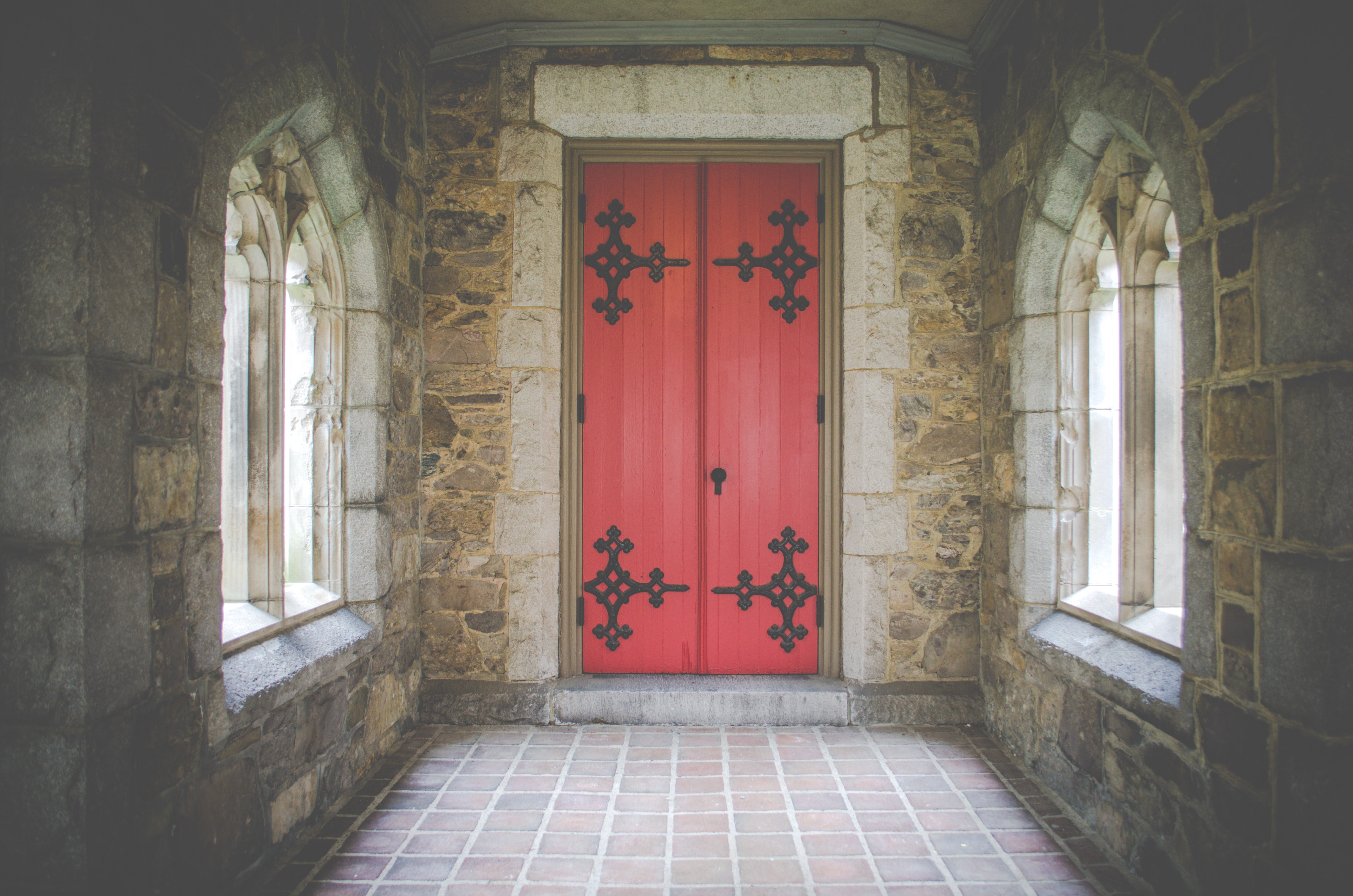
Red – it is energizing and increases the activity level within a room. Also, thanks to its stimulating features, it encourages conversation, gets people closer together, and whets appetite. It is a great color to give a strong first impression, but it also provokes that people leave the space soon. In dark tones, it is very elegant.
Yellow – this is the most cheerful color, it is also energizing, and invites to activity. It lifts the spirit and can make a space seem larger. This hue attracts people, it is welcoming, and stimulates the nervous system.
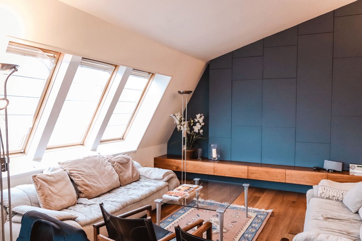
Blue – it is a natural relaxer. It physically lowers blood pressure and respiration rate, ideal for providing peace and serenity. In softer hues it may seem a little cold, but it also lights up the space, and it is perfect for rooms that get a lot of sunlight. The darker tones inspire trust and communication.
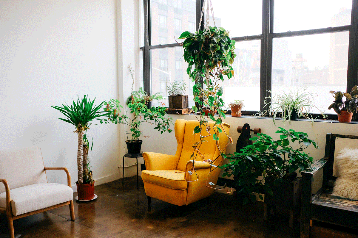
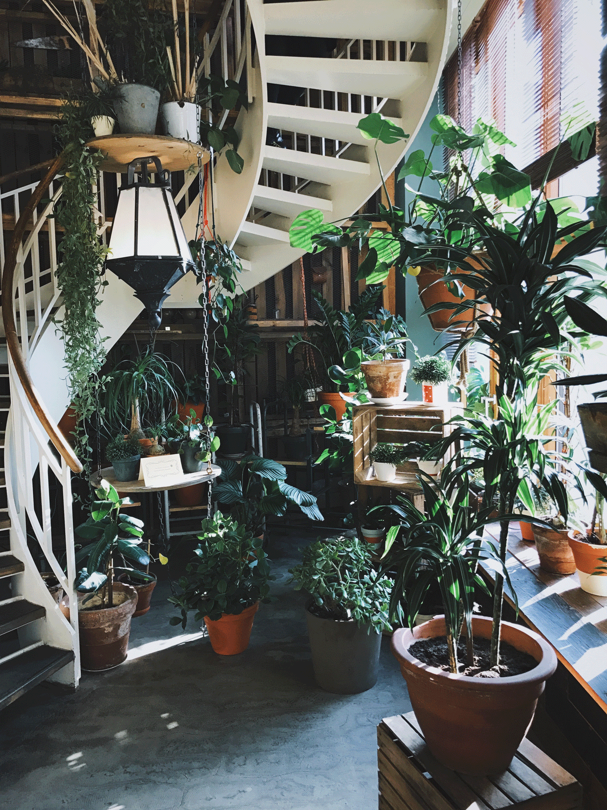
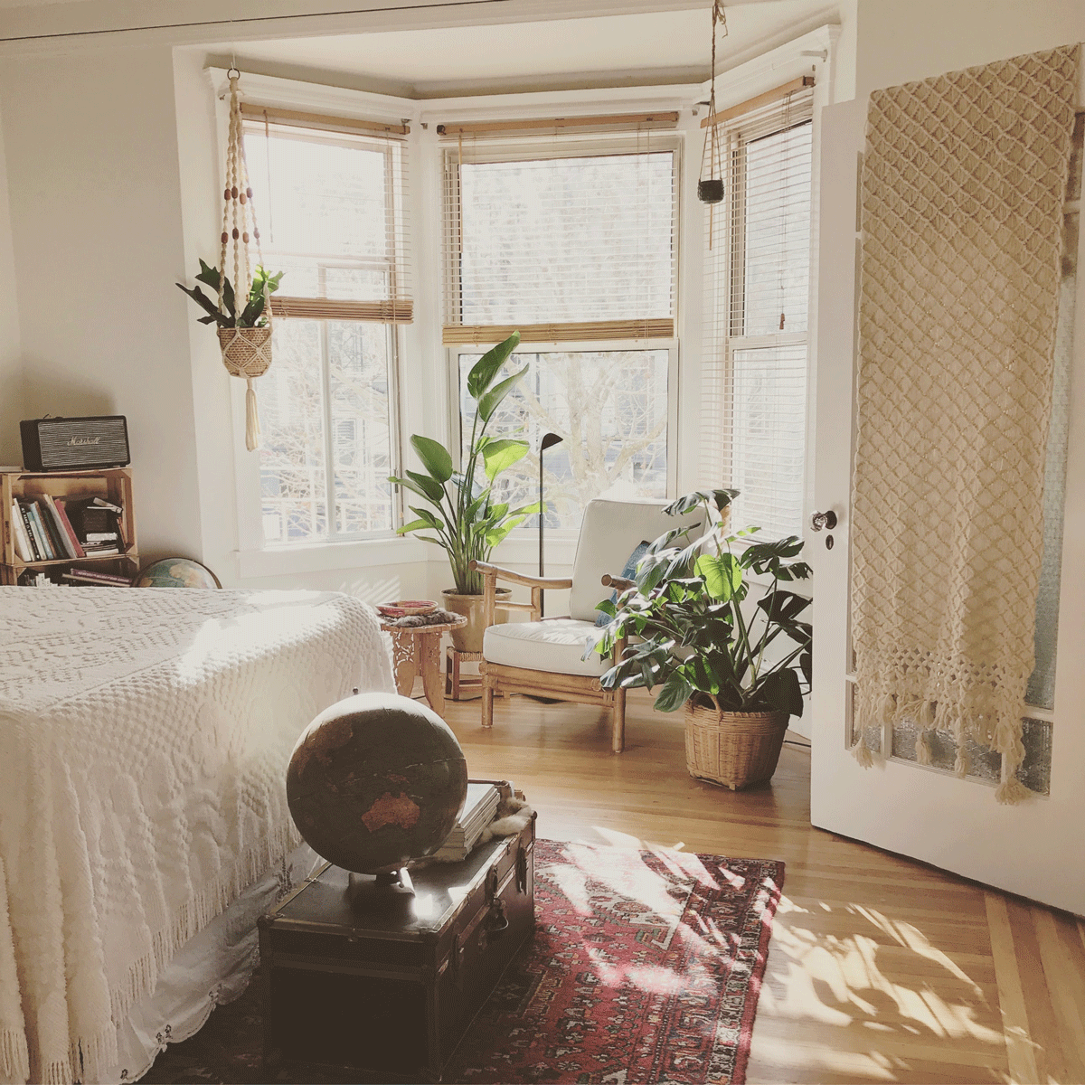
Green – this is considered the friendliest hue to the eye; it represents nature and you can stay in a green space for a long time. In its yellow hues it offers a joyful and refreshing effect, while its darker tones have a more relaxing, warm effect that promotes union. It means health, it keeps you in the present, and provides a feeling of balance, clarity, and stability.
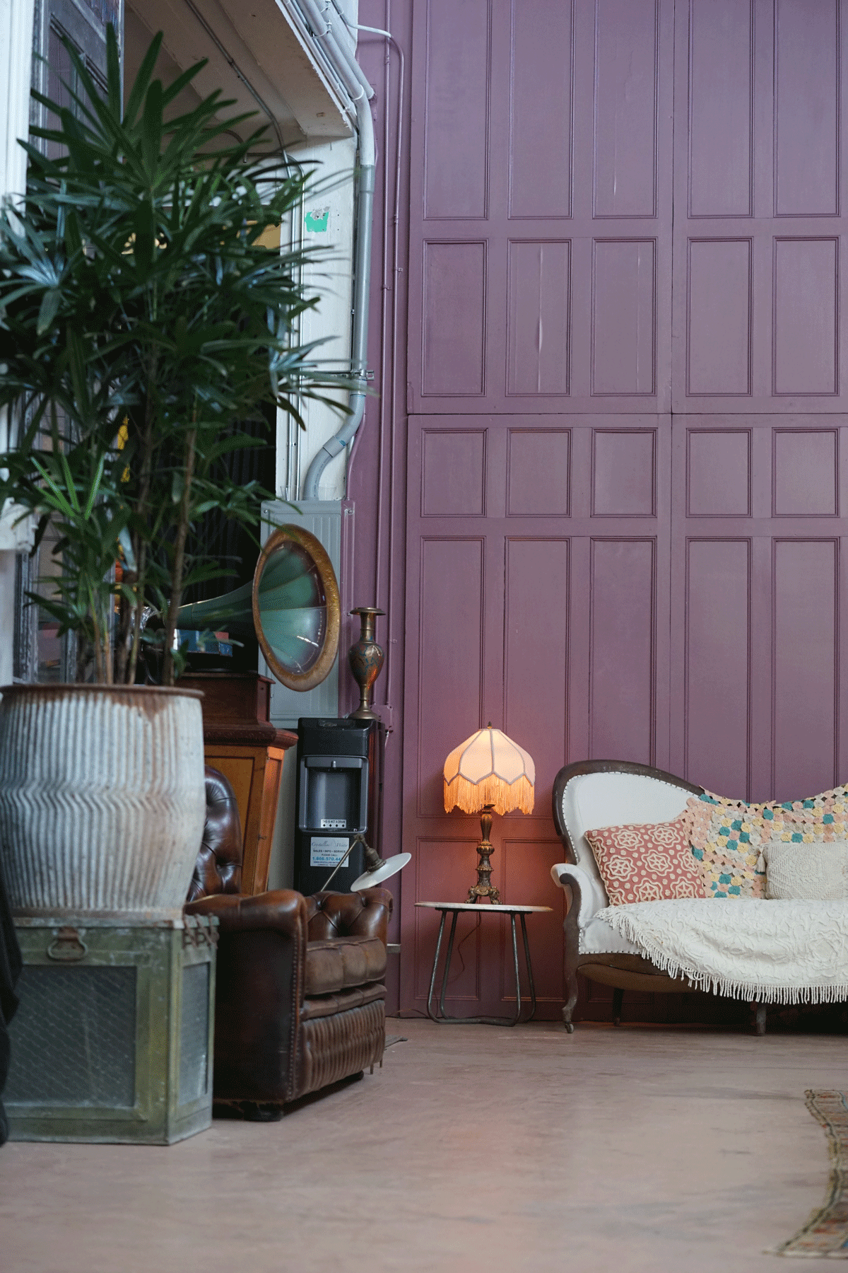
Purple – it is associated with creativity, luxury, and originality. Its more opaque shades express sophistication and dramatism. While the lighter, like lilac or lavender invite to relaxation and calm.
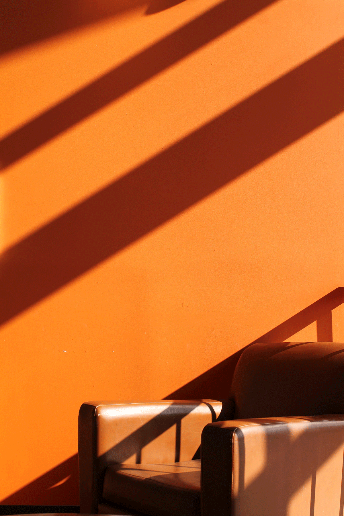
Orange – like other warm colors, invites to emotion, enthusiasm, and is energizing. It also whets appetite and creates a feeling of warmth and motivation.
Neutral colors – Black, gray, white, beige, and brown are calming and work as a great complement for balancing all the other colors. Black works for highlighting accents and adding depth. Beige and brown provide warmth and encourage conversation. Gray, especially its dark shade, is warm and elegant.
2020 Palette
This year, classics are making a comeback. Classic blue is being used in many rooms, reclaiming its calming potential. Basic colors also have a strong impact, particularly white is being chosen, even combined with different hues of it: white on white. Following the same line, light and pastel colors, like light pink, are offering a touch to different rooms, both in paint and furniture.
Regarding darker hues, burnt orange is used to provide a touch of energy to other colors, but without being too overpowering. On the other hand, midnight blue, black, or dark gray come back with even main roles. Also, forest green was strongly welcomed to provide a dark and elegant, yet friendly touch. When it comes to basics, the brown hue with the strongest trend is the one that mimics clay, taking nature indoors.