


A collection of art works by Kandinsky has been on exhibition at the museum inside Palacio de Bellas Artes, Mexico City, since October 31st and through late January 2019.
Celebrating this show, these words explore some key elements in his work and analyze how it has influenced design over the years.
Life, work, and thought
Wassily Kandinsky (Moscow, Russia, 1866 – Neully-sur-Seine, France, 1944) lived mainly between Russia, Germany, and France. His most transcendental work was created between 1910 and 1944 (to provide context, World War I went from 1914 to 1918, Monet painted Impression, Sunrise in 1872 and Picasso, The Young Ladies from Avignon in 1907), becoming part of the Vanguards and it was called “Lyrical Abstraction”.
He began studying Law and Economy, but at the age of 30 decided to leave his professional path and spend his time painting. Like other artists from the time, he started out painting landscapes with an Impressionist style, but little by little they stopped being figurative. These first works, even though they included elements that stood out, did not make a considerable difference from what other painters did at the time.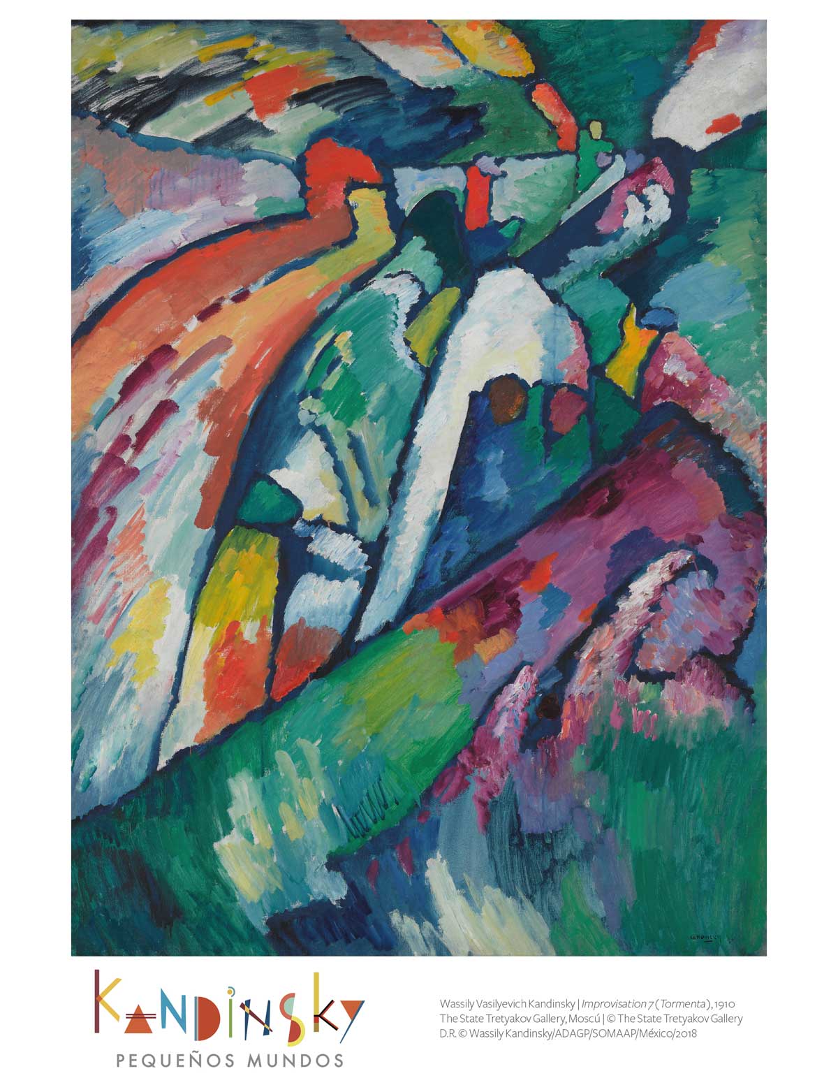
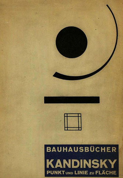
In 1910, Kandinsky published the book Concerning the Spiritual in Art and at the same time began the production that would eventually make him transcend within art. His second book was Point and Line to Plane. In both books he set a vision on colors, forms, and sensations, and their effect on the spectator. Concepts were not only visual and representative for the painter; this was a spiritual and philosophical matter.
In these texts, he explains his work and how he gets his results, by discovering the relationship between music and painting, which would shape most of his works, that would later become a pictorial representation of melodies, rhythms, and chords. This is the reason why his work is classified under Lyrical Abstraction.
His exploration of these matters considers colors, geometric shapes, and the canvas where it all happens as basic elements, each one being an intrinsic sensation that has an impact on the spectator. Once these elements are understood, he also considers the results they offer when combined.
“The obvious features we see when looking at an isolated color that is left to act alone, are warmth or coldness of the color’s hue and on the other hand, the clarity or darkness of said tone. Warmth tends to yellow and cold tends to blue; yellow and blue form the first great contrast and dynamic. Yellow has an eccentric movement and blue a concentric movement; a yellow surface seems to be moving closer to us, while a blue surface seems to be moving away. Yellow is a typically earthy color, whose violence may be painful and aggressive. Blue is a celestial color, evoking a deep calm. The combination between blue and yellow offers a result of immobility and calmness, which is green”.
Influence on design
One of Kandinsky’s great direct contributions to design was being teaching at Bauhaus between 1922 and 1933, where he taught Basic Design and Advanced Theory of Design. In addition, and in the form of a legacy, the artist contributed to the theory of design in two ways: the first one, through his work and the formal study that resulted from it; the second one, his theory. In some way, his works are a subjective and personal application of his theory, meaning that the theory he worked on can be implemented in other ways and contexts.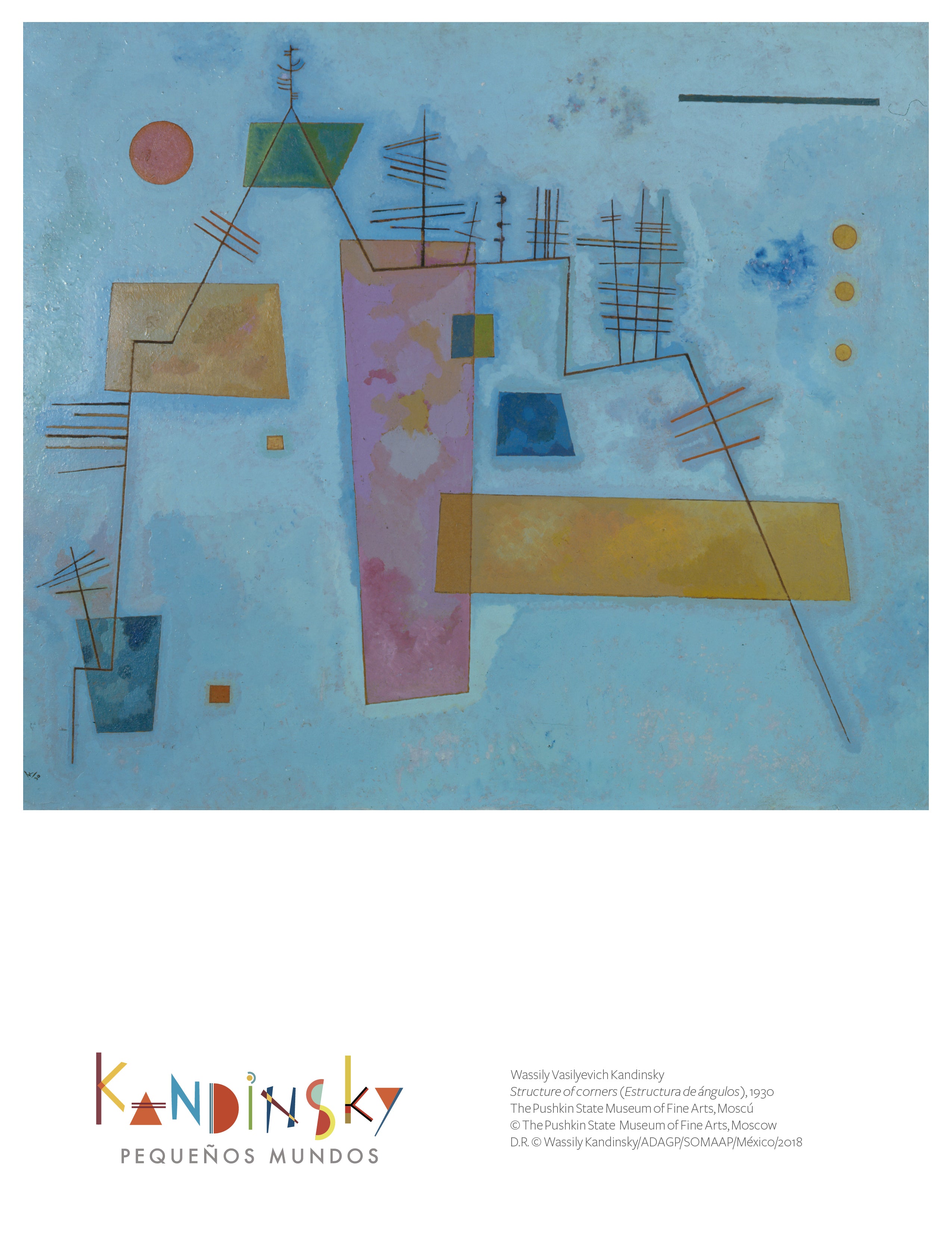
Studying Kandinsky is interesting from the perspective of modern semiotics, or relating his postulates with the current color psychology. We know that both auditory tones (notes) and colors have a frequency and that human beings can capture a certain range. Depending on the frequency, we will get a certain color tone or note. And so, it is possible to relate colors with notes and apply concepts like rhythm, repetition and power to them. Tones, both in audition and in color, create sensations. Even though we know these sensations are not universal, they do have certain generalities.
This is why for design (beyond considering graphic palettes or geometric compositions by Kandinsky), an essential element are his postulates, whose concepts can be addressed from architecture, industrial, graphic, and digital design, and other disciplines. If we add to these principles, elements from each of them (materials, textures, movement, vegetation, and even the human factor), compositions and its sensations expand...