What would become of cinema and television without design? Even though it may go unnoticed, it is essential for every production; it takes us to other worlds and makes us become part of the story. The most important thing worth mentioning is that while it goes unnoticed, it is in this way that we can tell a good design from a bad one, when it makes no sound or even steals the main character’s thunder.
Throughout the history of both formats, there has been a large amount of memorable sets, which through architecture, decoration, and location choices have taken us to unimaginable realities. These designs, in order to be successful must help keep the audience hooked, whether by turning the environment into something complementary and in harmony with the character, or the opposite, by being a contrasting space for the character. All this without an evident influence from the designer; it should feel natural for the story and the scene.
Here are some of the best achieved production designs for cinema and television.
Mad Men
Life in an advertising agency in the 60’s would have not been believable without the right setting. The space takes spectators back to that time, surrounded by wooden panels, imposing desks, and low couches. Design Producer Dan Bishop was nominated several times to the Emmy for this television series. Within the most significant spaces, Don and Megan’s apartment and the office stand out. One of the tricks used by the designer was to make spaces seem integrated to the characters’ lives and not to look new; in order to make this possible, he takes care of objects not being perfectly arranged and for the architecture to have worn areas on the surface.


The Handmaid's Tale
Design Producer Julie Berghoff has filled this Hulu series with details, which has also taken her to the Emmys, and won her the prize in 2019. The designer plays both with present elements and with those which are not there and, it is their absence what gives them meaning, for example, the lack of mirror in Offred’s room, to avoid vanity. In addition to small details, which can be appreciated even on the ceilings with finishes inspired by the Italian Renaissance, Berghoff has taken contrast as foundation, from an absolute austerity to red colored impacts. Among the iconic spaces in the production are the main characters’ rooms, with furniture and decoration elements that speak about their lives, current and past ones. Also, the space becomes important when the character interacts with it, and so it is filled with textures and patterns. Another key environment is the office, contrasting the bedroom, loaded with objects that represent all that is prohibited.


House of Cards
Even though design might not be important to a series whose topic revolves around politics, Production Designer Steve Arnold was so careful with the space that it managed to reflect this complex world. Some interiors have been created with extreme care in order to represent the inside of the White House exactly. Something that Arnold takes full care of in his designs are colors and spaces, the way they are handled provides solemnity and seriousness to the scenes. As the seasons of this Netflix series progress, new sets have been added to represent the relationship with new characters, as well as the complexity of the story; for example, one of the challenges was to represent other parts of the world without traveling to these destinations and to have them all built within the studio.


Pain and Glory
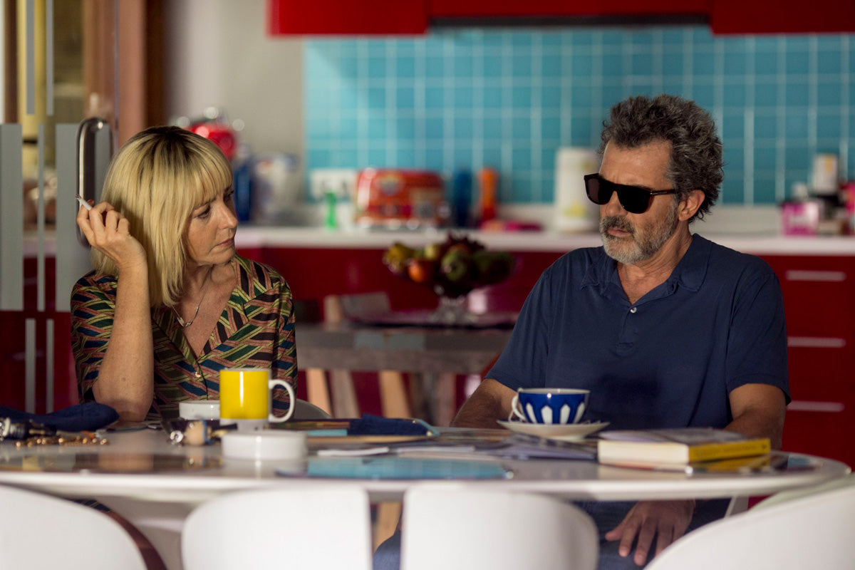
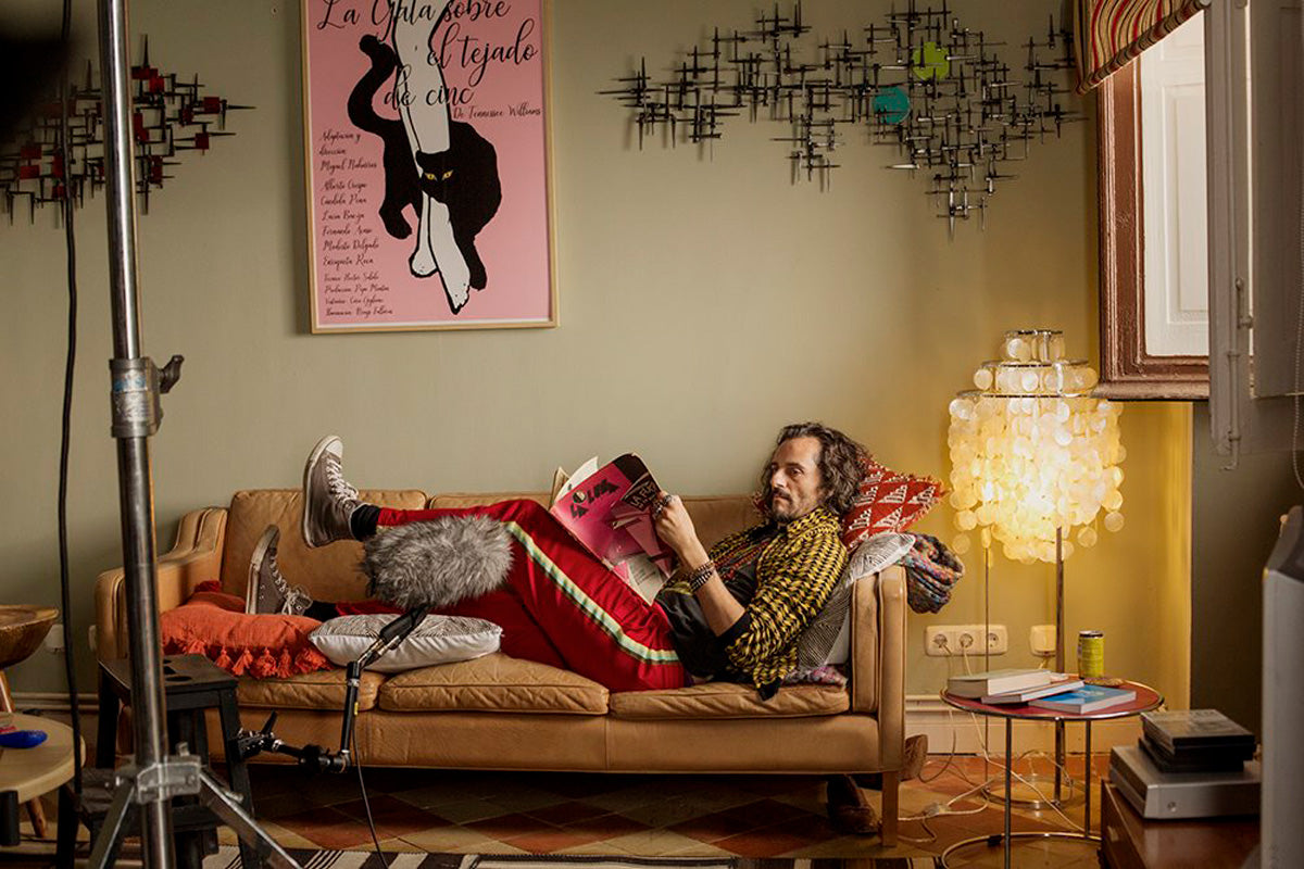
Pedro Almodóvar worked along Production Designer Antxon Gómez to recreate his own residence in Madrid, reason why some real pieces owned by the director were used in this particular design, items like artworks, furniture, and even clothes. The representation of reality was the foundation for this design and, even though it is not an autobiography, the similarities between the character and the director are reinforced through the set’s architecture and design. Among the details that stand out in this film is the way light enters, seeking to copy the way in which the original house is illuminated. The kitchen is one of the best achieved sets, whose red and blue cabinets are characteristic of this environment in real life. Even though this is not an exact replica of the house, what Gómez meant to get was the essence of such home, in order to take the audience to Almodóvar’s world.


Once Upon a Time…in Hollywood
In the most recent edition of the Academy Awards ceremony, the film directed by Quentin Tarantino got the Oscar acknowledging its design, led by the team formed by Barbara Ling and Nancy Haigh for set decoration. The designers recreated life in Hollywood in 1969. As if dealing with a time machine, the film takes spectators to iconic places of the time, like Cinerama Dome. In all, they created 150 environments, among which the Playboy mansion, the houses in Hollywood Hills, and Pandora’s Box stand out. Despite having recreated several of these places, the idea they had in mind was not to create an exact replica of the city back then, but to achieve a feeling of nostalgia for the past in the audience and making them feel as though they were there during that time.


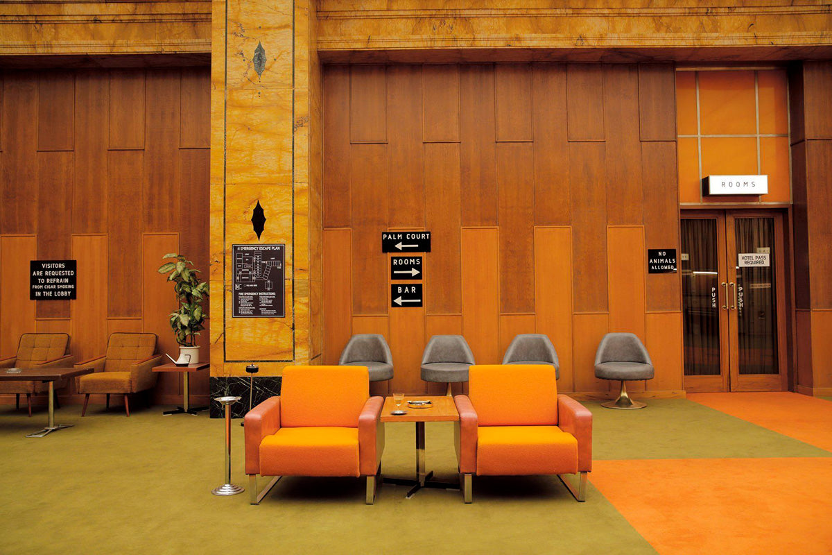
The film, which premiered in 2014, did not get an Academy Award for production design, instead it has become an icon on the matter. In this case, the prominence of design was intentional, in order to turn the hotel into another character in the movie and so it would evolve by the hand of the main character. Director Wes Anderson usually includes many details in his movies and this time, the transformation of the hotel can be seen as time goes by and the creation of messages through design itself, the color palette, and the choice of certain items. In this case, Production Designer Adam Stockhausen created the hotel in an existing building, an abandoned department store and, as if working on a blank canvas, he turned the interior into a hotel, which transformed into the main setting where the different environments were built, and show different moments in time.


