Forgotten cities which are launched to stardom thanks to an architectural plan, projects that mark new times, trends people will talk about for many years to come, and buildings that impact more than what they hold inside.
Works of art rise to touch the sky and offer what was considered to be impossible to the eyes of their visitors. Limitless architecture with a goal: to fill their cities with life.
Museo Guggenheim (Bilbao, Spain)
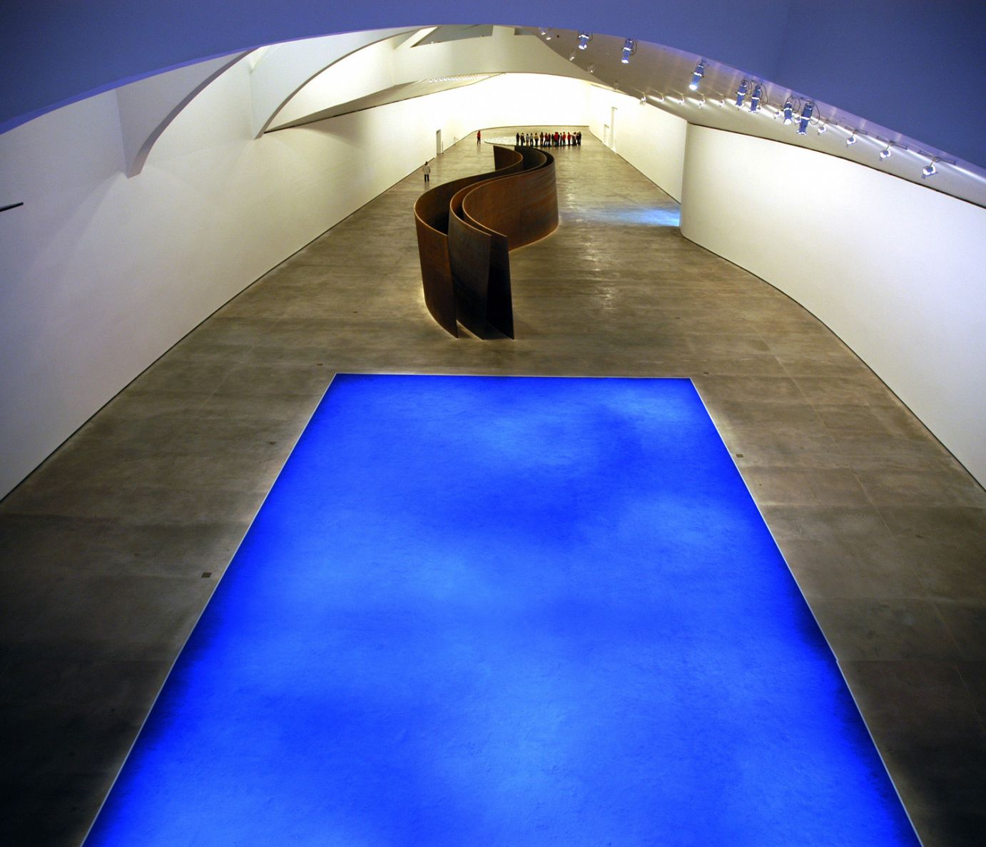
The Guggenheim Museum rises by the banks of the Bilbao River. Its brightness and shapes stand out from the distance, its presence makes an impression on all people who love the field, since its vertiginous curves defy laws and place it as one of the most important works from the 20th century. Architect Frank Gehry is the master behind the project and his vision was captured in a 24,000m2 extension, of which 11,000 are destined to exhibition areas.
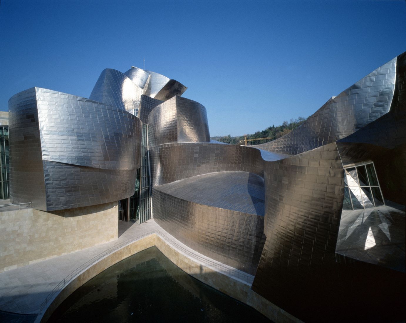
The museum was part of a master plan to renovate and modernize the port city. In 1991, the Basque government asked the Solomon R. Guggenheim Foundation to finance the construction of the new museum and in 1997 (year of its opening) thousands of tourists visited Bilbao to see the new architectural attraction. Perhaps this is one of the works which has had the most impact in a city for a long time and, thanks to it, today this is called the “Bilbao effect” which, in addition to being positioned as architectural and cultural reference, the project attracted, in only three years, a total of 3,600,000 visitors to the Basque Country. 83% of them were there exclusively to visit the museum and also, its existence has created 4,000 jobs approximately, which were kept due to the movement provoked by the facilities.
Its design was so complex that in order to start it, CATIA was employed (3D design software initially used for the aerospace industry). This program was employed to faithfully translate his concept to the structure and thus make its construction easier. The materials used were limestone, glass, and titanium, the latter was employed for the building’s skin, with approximately 33,000 plates, to achieve the rough effect.
Casa da Musica (Porto, Portugal)
Porto is one of Europe’s most visited cities, something relatively new since tourism in Portugal grows with the passing years and it is positioned as architectural reference worldwide. In 2001, it was chosen as one of Europe’s cultural capitals, reason why the City Council and the Minister of Culture created Porto 2001, project whose purpose is to promote and carry out different urban and cultural interventions across the city. In this way, OMA (an international architecture and urban planning firm led by nine architects (Rem Koolhaas, Ellen van Loon, Reinier de Graaf, Shohei Shigematsu, Iyad Alsaka, David Gianotten, Chris van Duijn, Ippolito Pestellini Laparelli, and Jason Long) won the project for a new concert hall located in Porto’s city center.
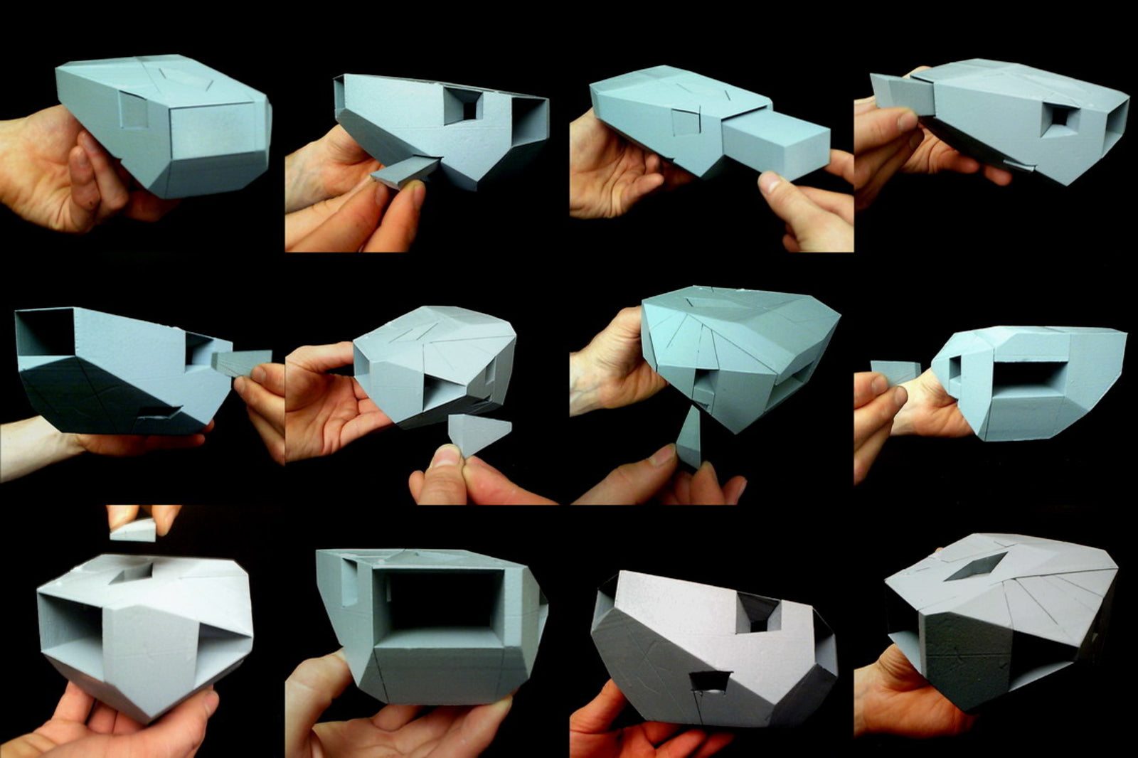
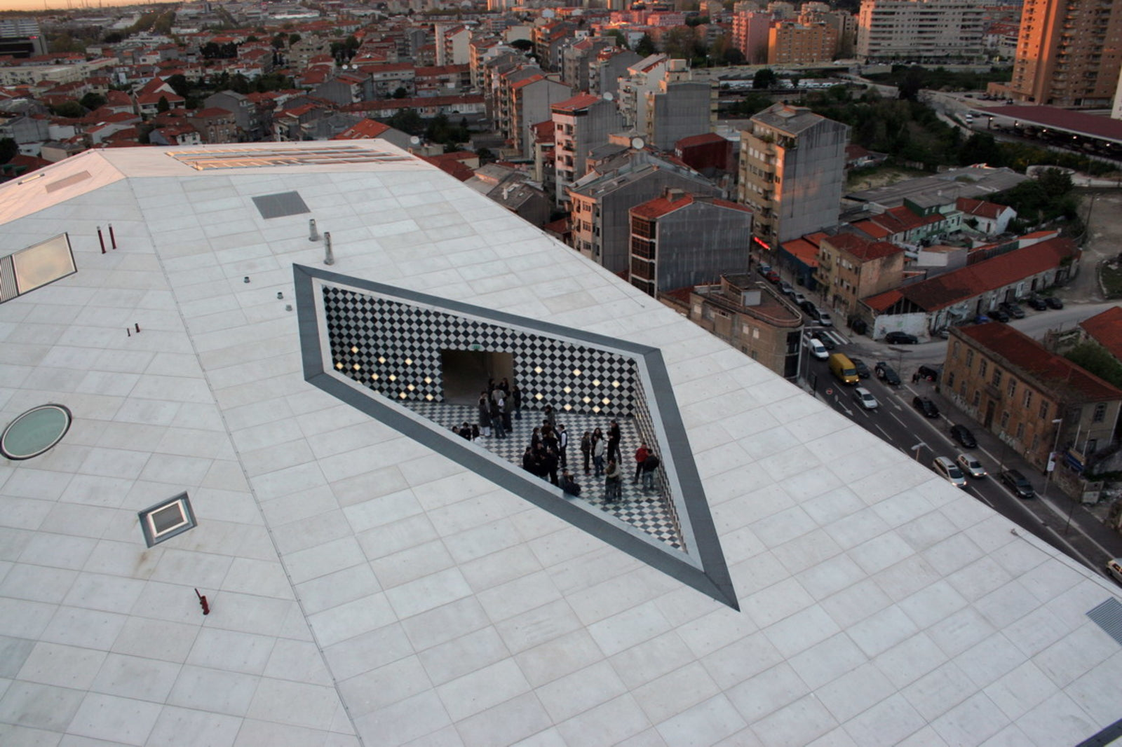
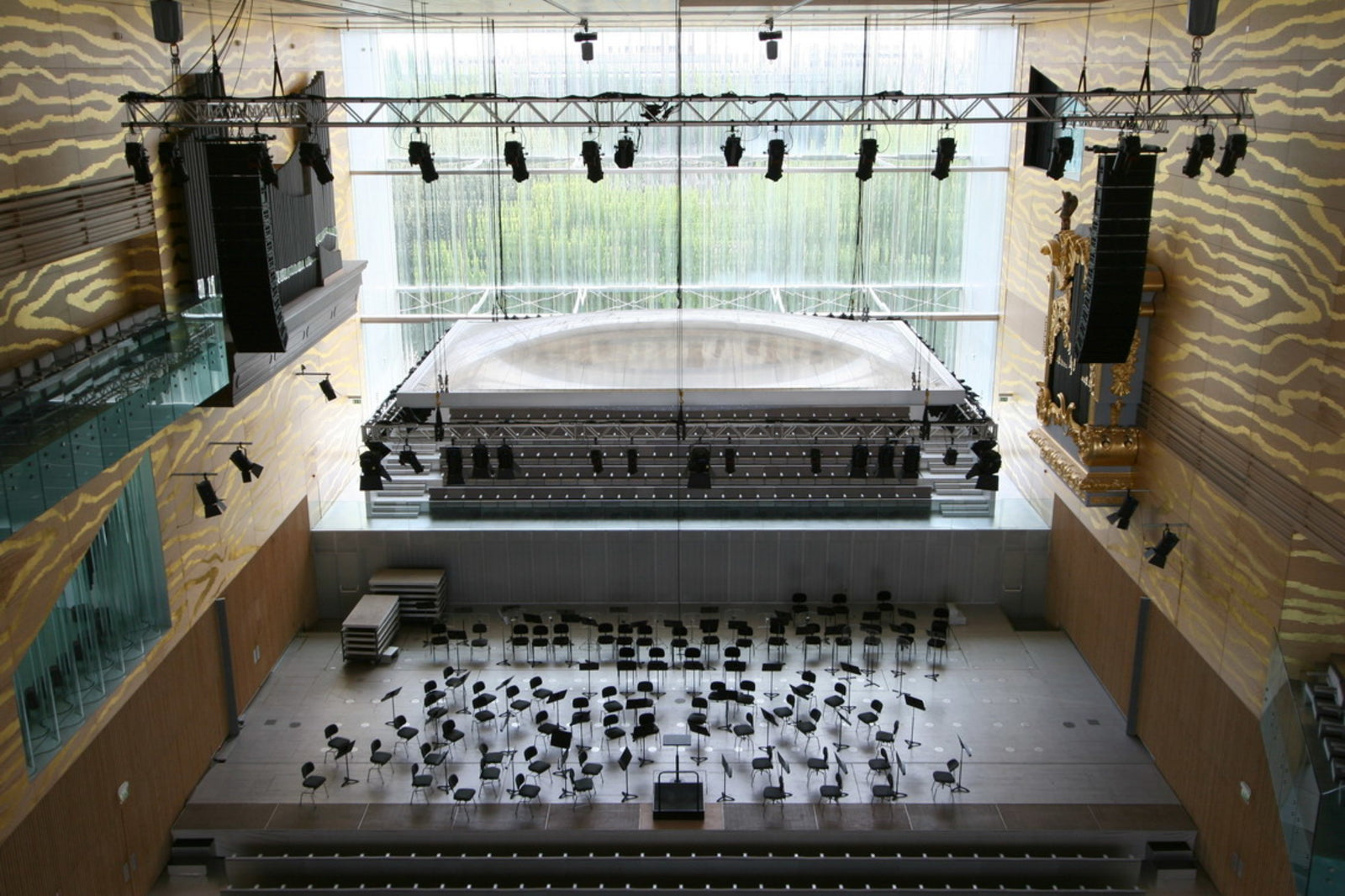
Its construction placed the Portuguese metropolis on the map of great architectural cities and today it is still reference thanks to its geometric design, white concrete façade, and original interior that stands out for its walls, coated with plywood and veins with golden relief to make an impact on the viewer’s eye. The VIP area in Casa da Musica is decorated with hand-painted blue tiles; also, visitors can be delighted with the views from the terrace (on the rooftop), lined with a geometric pattern of black and white tiles.
The main space is the Great Auditorium, offering 1,300 seats, it features corrugated glass facades, turning Porto into the opening curtain for presentations. There is no such thing as a lobby and the spaces next to the Great Auditorium are connected through stairs. Among them, we find a theatrical space with fixed seats, 10 rehearsing rooms, recording studios, a restaurant, and a teaching area.
Kunsthaus Graz (Graz, Austria)
Colin Fournier and Sir Peter Cook’s (architects) friendly alien was inaugurated in 2003, the same year in which Graz obtained the Cultural Capital of Europe title.
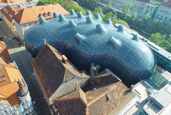
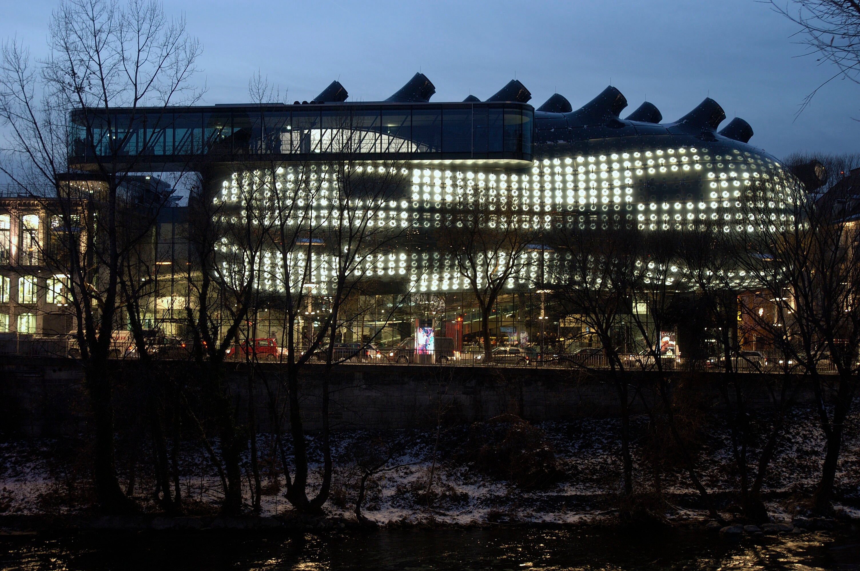
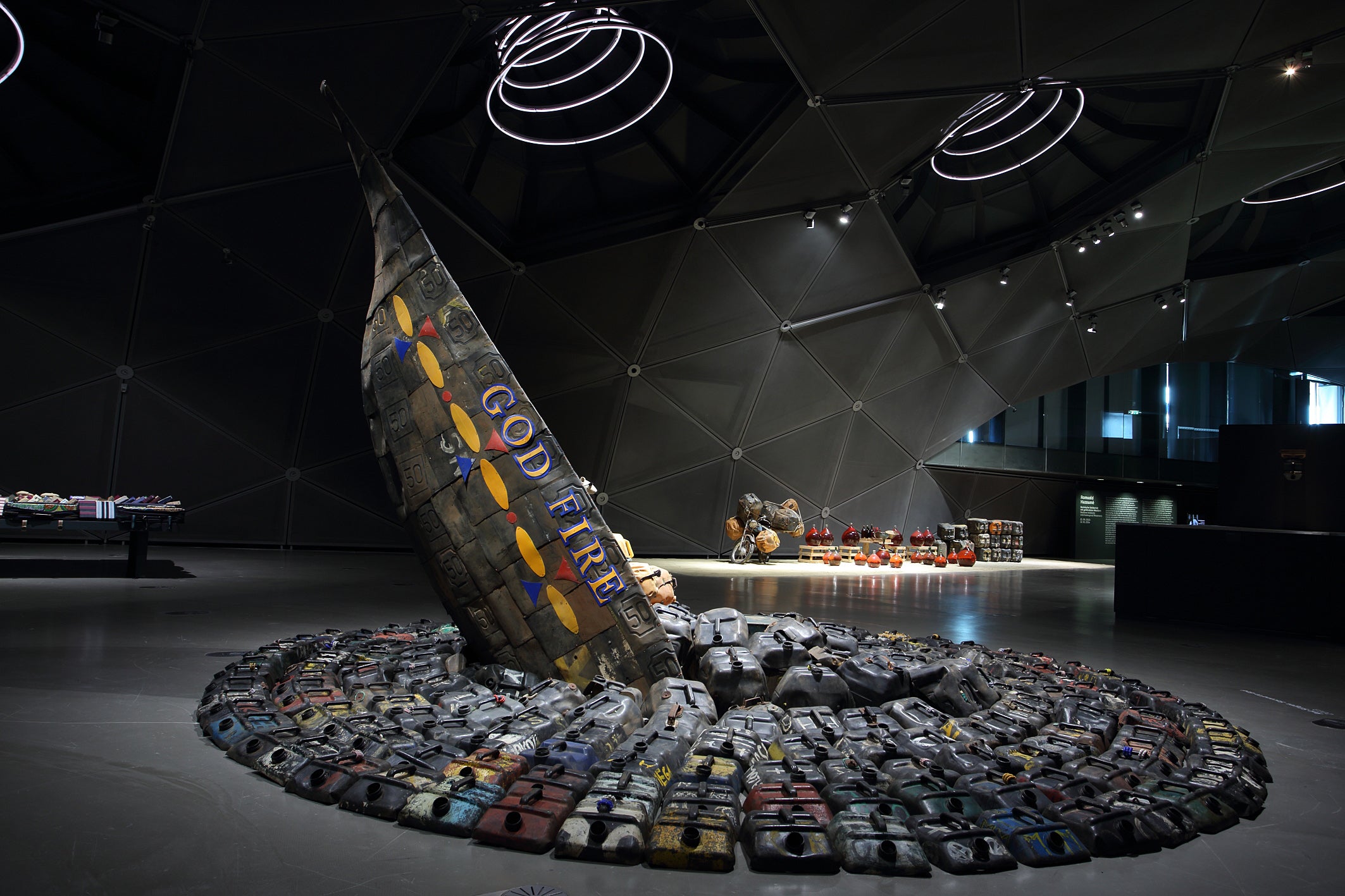
The biomorphic building rises in the city center defying the ultramodern stretch against the historic Austrian location, to present the perfect blend of two eras. Also, it is environmentally responsible, since its exterior is made up by solar panels, which generate the power needed to run the facilities. Its curvy façade is known as Big Façade, since it boasts a screen with sources of light under its skin and these are computer-controlled. The collections exhibited are related to contemporary art, cinema, and design.
This work stands out for the agility with which it was coupled to the city, which, as if by force of attraction, fits perfectly. It also integrated urban districts, which were forgotten.
Elbe Philharmonic Hall (Hamburg, Germany)
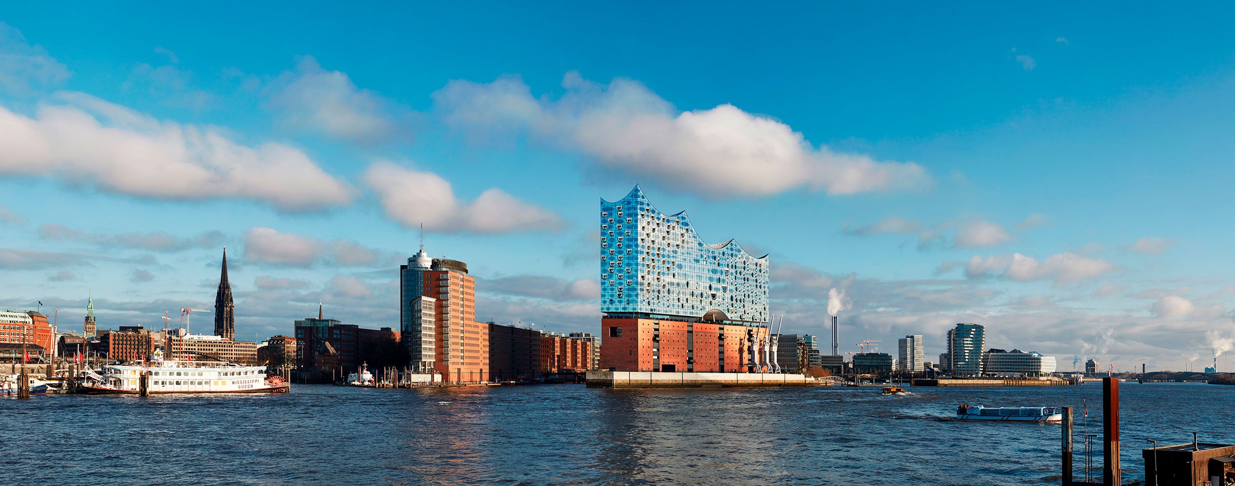
Considered 2017’s most important work, it was designed by the Herzog & de Meuron architecture firm, who decided to place it on top of the Kaispeicher A building (made in 1960 and whose purpose was to store tobacco, cocoa, and tea), project carried out by architect Werner Kallmorgen. Both parts of the building are united by the Plaza, space open for the public with access to the different areas of the Philharmonic.
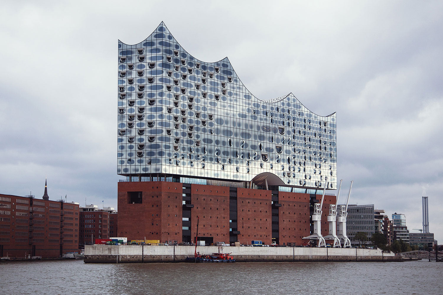 Grand Hall is the main auditorium, 50 meters tall and featuring 2,100 seats, it stands out for being the heart of the philharmonic. Another outstanding area is the Plaza, space dedicated to visitors with 360º views of the city and the port. Tourists and locals can also enjoy its restaurant and amenities.
This is undoubtedly, a door connecting the city of Hamburg with the world of music. The philharmonic has set its mind to discovering new sounds and become the setting for relevant solo singers and orchestras. Its design, from the 21st century, rises in the distance and, thanks to its glass façade, the music shelter gets lost with the city’s horizon, creating an interesting visual effect for people who love architecture.
These are just a few examples of buildings used as restoration tools, a trend that has been increasingly adopted by great cities of the world and which results in an amazing architectural legacy.


