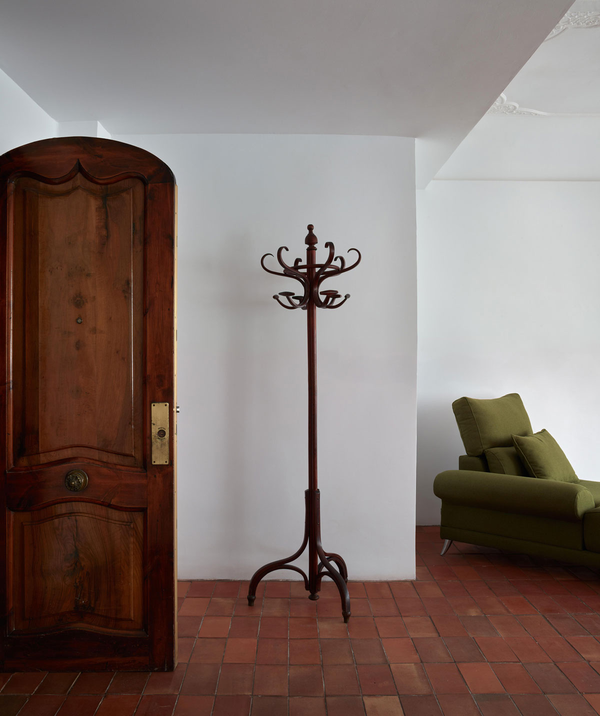
To the minimalist essence, to when “less is more”, phrase made popular towards the end of the 40’s by architect Ludwig Mies van der Rohe and which today is stronger than ever before. Simple shapes, geometrical abstractions that focus on color and lines, celebrating light and shadow. Here is a clear example.
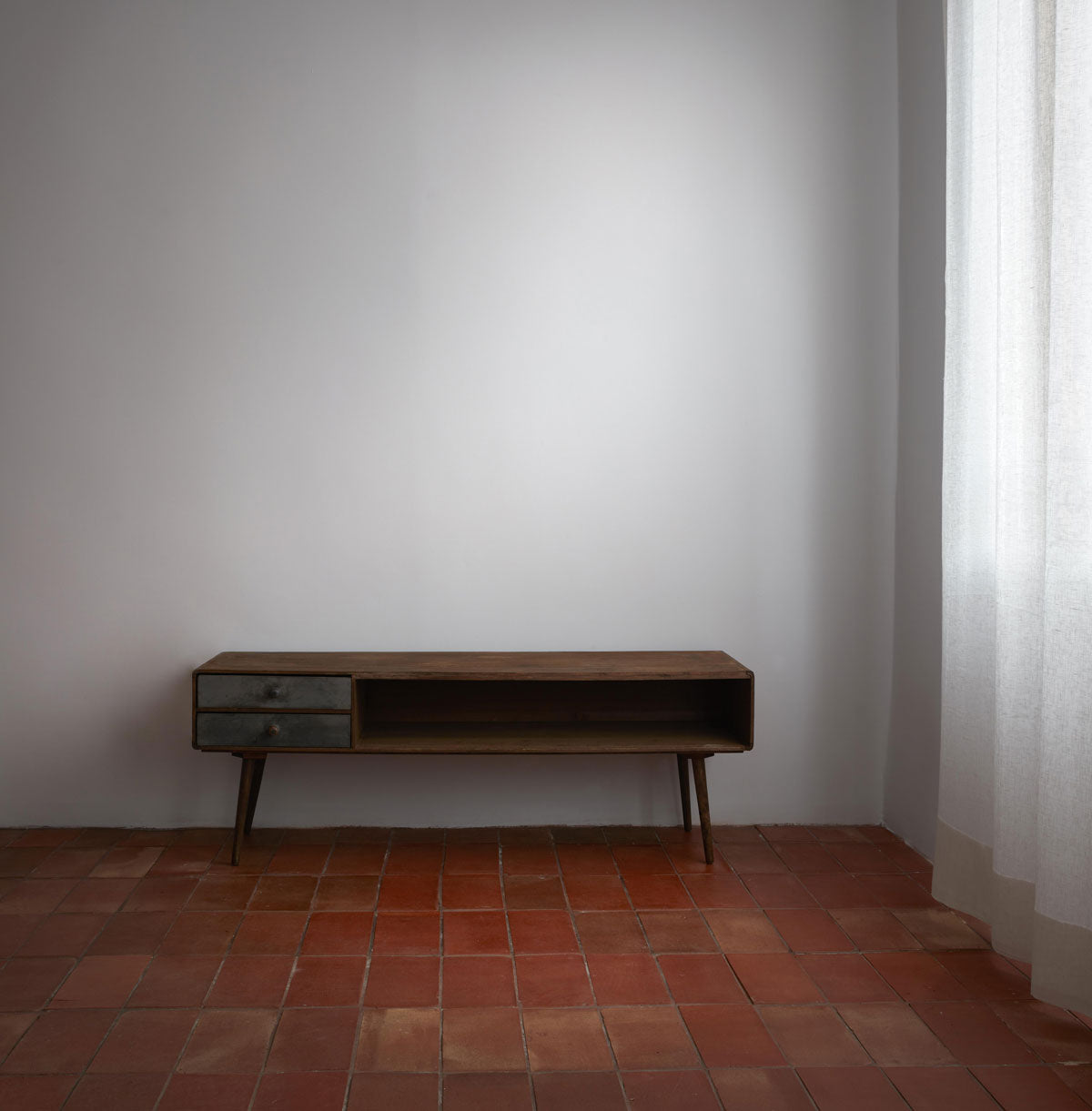
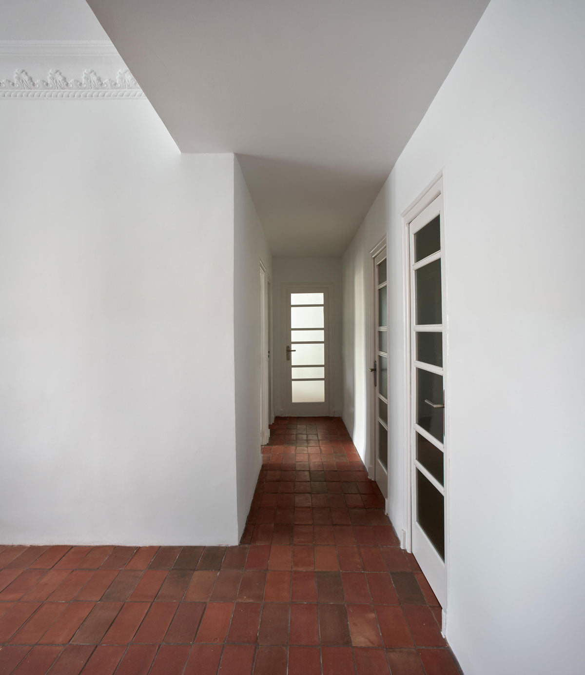
With a contained range of colors, these old offices became, after a renovation, a house where the white from the walls and ceilings along with the handcrafted ceramic flooring (in a rectangular format) are the absolute protagonists.
According to the design studio, the floor, through its hue and shape, will provide continuity to the whole space, while it highlights the beauty of the ceilings.
The original distribution was a succession of living rooms connected through a long and dark hallway. When the space was reinvented, it was reorganized to add light to the interior of the house and equip it with higher quality.
In this way, the moldings that had been hidden by a faux ceiling come to light and they decide to recover the main height in each room by leaving the moldings in sight, but this time, after a careful restoration.


Architecture: Quadrat Estudio | Photo: Mariela Apollonio


