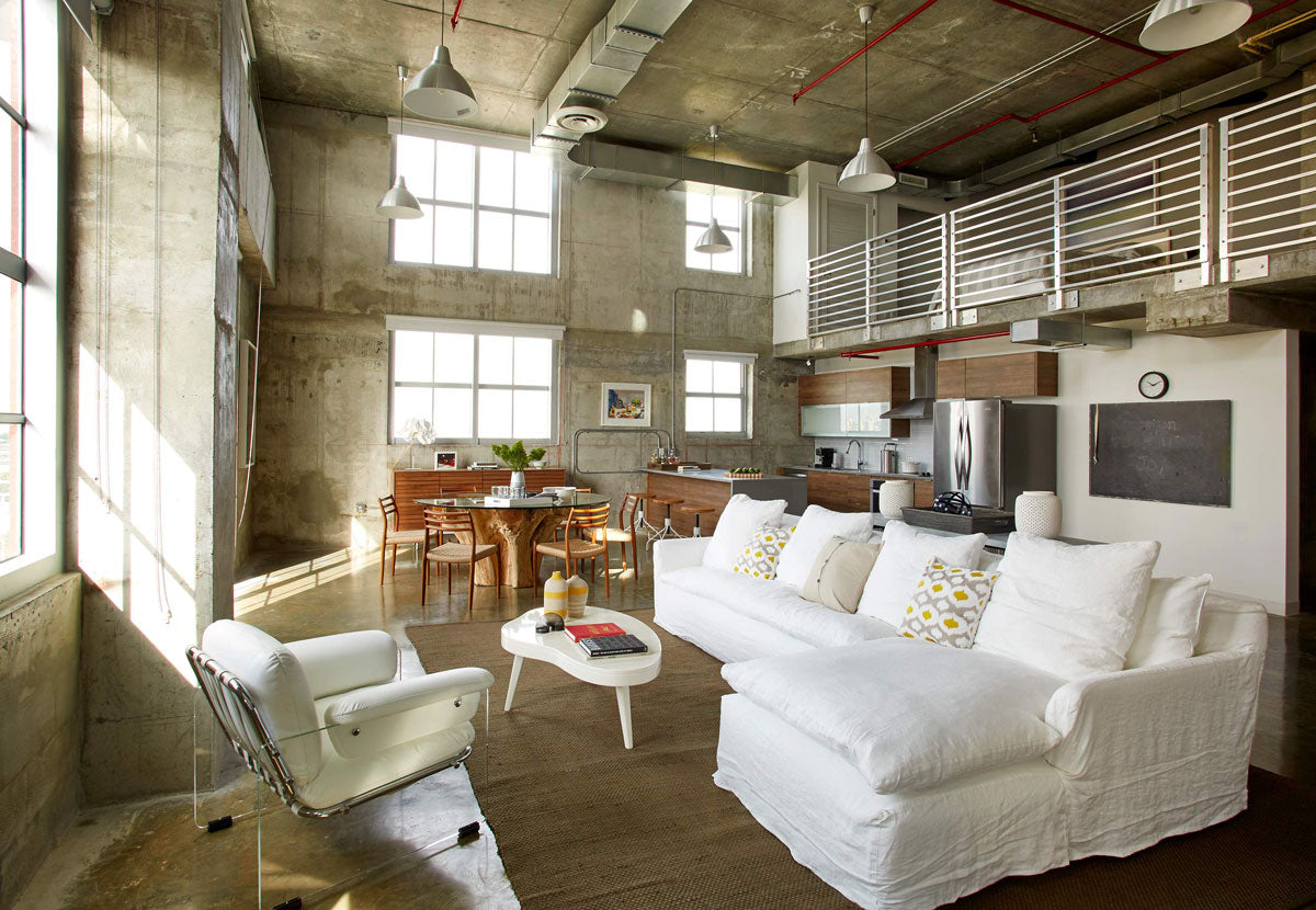
The open design trend in homes will not stop growing. Increasingly more homes choose to get rid as much walls as possible in order to create wide spaces where the different areas coexist in harmony. This kind of design, also known as open-concept, was born by eliminating walls between the living and dining rooms, then it integrated kitchens and so on, little by little until it reached bedrooms where the bathroom is integrated.
The benefits of having an open plan are many, where the entry of natural light to most of the house and the feeling of having more space stand out, which is appreciated in smaller homes. Also, it is important to mention that this kind of design is very convenient when visits arrive, it opens space up for larger furniture or more pieces and it increases circulation options.

However, open spaces are not always in the taste of everyone, especially when the openness is taken to more private areas. For example, many apartments have started eliminating bedroom walls, integrating them to the rest of the space. In order to do this, a subdivision of this kind of design has been born, which is called segmented open space. This consists in dividing without the need for walls or doors, with the purpose of differentiating areas by their function. For this, elements like a change of color, materials, illumination, or levels are used; also divisions through partitions, curtains, or screens. In this way, the atmospheres are interconnected and yet keep their individuality.
On the other side, there are people who wish to take the concept to its greatest expression. Bedrooms with integrated bathrooms have become a luxury standard within the hotel area, but now they are starting to appear in homes as well. The idea of turning the room in a relaxing oasis has opened the door to elements that used to be hidden behind walls, like bathtubs, which provide a spa feeling. Increasingly more elements have gained ground and today, having the bathtub, sink, and shower in the same space is more popular than ever. The way to do it is what changes, some of these concepts keep a dividing wall, but no door to help circulation flow; others just place a bathtub with an exquisite design near the bed; and some others install a shower with glass walls in the bedroom, being totally true to open design.

By the hand of the aforementioned, another design to be increasing in popularity is the one that eliminates the division between interiors and the outside. The integration of large windows that open, whether in dining or living rooms, and give way to a terrace with the same or similar decoration in and outside is eliminating the borders between both spaces, which used to be seen completely separated. The idea is for the house to look as a whole, with the difference that one area is roofed and the other one is not. Exalting continuity can also be achieved by adding outdoor elements, like plants, to the closed section.
Tips to create harmony in an open space
- Create groups: the fact that things are together does not mean they are mixed up. The furniture should be divided according to each space’s function. Once each group is separated, details to differentiate them must be added; for example, a carpet that divides the living room area, shelves that set the dining room border, a well defined bar in the kitchen, etc.

- Unique personality: even though there are no doors, each area should have its own personality, reason why it is important to choose a focal point that captures the attention in each area. In this way, we create separated rooms, even without walls; each one of them must make people in them feel different.
For example, a chimney or a warm light lamp can provide a more cozy feeling to the living room, while a flashy chandelier can lure people into the dining room, or a built-in spice rack can create the perfect ambiance to cook.
- Well-defined hallways: the best way to avoid areas from mixing up is to keep space between them. In addition to hallways that offer space to move between furniture, a wider one should be considered (also known as negative space) between areas.
For example, in order to avoid the living room from blending with an office on the same plane, a wide separation must be made between the last armchair and the bookshelf or desk, since it belongs to another function.
- The power of color: visual harmony is easily achieved through one color palette. Even though each space can have its unique touch, it is important to maintain one base color, preferably neutral, along the whole blended space. This accentuates that, although each one has its own function, they are part of a whole.


